When it comes to the world of design, it’s often perceived that B2B (business-to-business) projects are the less glamorous cousins of the more high-profile B2C (business-to-consumer) endeavors. Conventional wisdom suggests that B2B design is synonymous with a lackluster, “safe” approach, and rarely leading in the broader creative field. However, as a feisty group of passionate designers at Spire, we beg to differ. In this blog, we will state our case by showcasing a collection of creative B2B design projects that shatter stereotypes and prove that B2B design can be as exciting, dynamic, and impactful as its B2C counterpart.
The realm of B2B design may not always take center stage in creative discourse, but it’s a thriving landscape of innovation and creativity. We believe that this misperception stems from the misconception that B2B design is limited by corporate constraints. However, as you’ll soon discover in the following project highlights, B2B design is a playground of possibilities, where talented designers collaborate with businesses to craft visually stunning and strategically sound solutions that not only serve their purpose but also captivate audiences.
Four of Spire’s award-winning designers have each handpicked a project that best exemplifies the potential of B2B design. Their unique and diverse experiences will demonstrate how B2B design can be a dynamic and impactful field that rivals, if not surpasses, the world of B2C design. As you explore these creative endeavors, we hope to inspire a newfound appreciation for B2B design and to challenge the preconceived notions that have held it back for far too long. It’s time to celebrate the artistry, innovation, and power of B2B design and recognize it for what it truly is: a realm of endless creative possibilities.
Now, here are four pieces of B2B work selected by four of our B2B designers.
1. Thinking outside of the square: Squarespace’s rebrand and the power of minimalist design
by Principal/Associate Creative Director Jason James
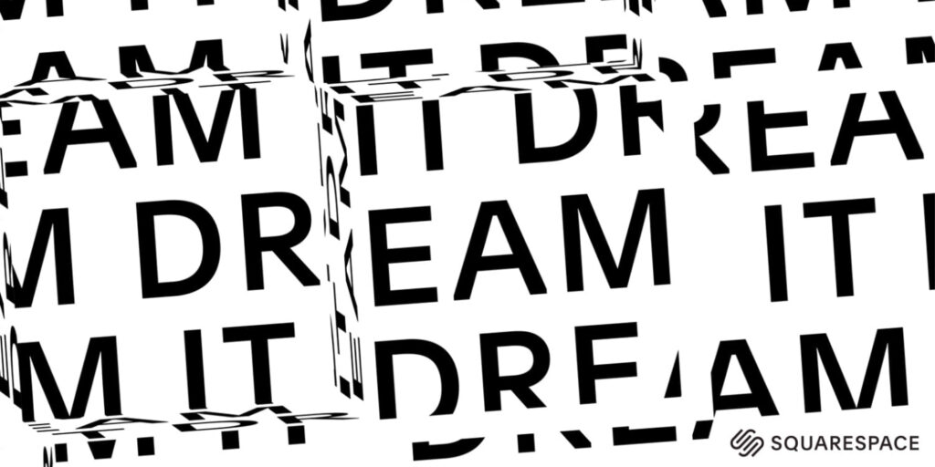
In a world inundated with vibrant and kaleidoscopic design trends, Squarespace’s bold rebranding strategy has caught the attention of businesses worldwide. The platform, known for its user-friendly website-building tools, has embraced a minimalist black and white design aesthetic and kinetic typography to support businesses in a way that goes against the grain of the typical brightly colored design trends. This rebrand is a testament to the power of simplicity and, while anyone can build a site on their platform, Squarespace’s rebrand was oriented specifically towards entrepreneurs and small business; the purpose of which can redefine the way businesses communicate their identity and purpose.
Squarespace’s Minimalist Black and White Design: The stark contrast of black and white in Squarespace’s new aesthetic is more than just a visual choice, it’s a statement. In an era dominated by sensory overload, this approach invites businesses to communicate their message with elegance and sophistication. The minimalist design allows for a clean canvas, enabling businesses to emphasize what truly matters: content, functionality, and purpose. It also sends a message to businesses: “We bring the foundation—you bring the color.”
Kinetic Typography as a Game Changer: Kinetic typography, another integral aspect of Squarespace’s rebrand, takes their design approach to a new level. The dynamic and animated text injects life and energy into the static black and white backdrop. This innovation is not just about aesthetics; it’s about capturing attention and creating an engaging user experience. For businesses, it offers a clean and effective way to convey their story and make a lasting impression on their audience.
Squarespace’s rebranding approach is a testament to the idea that, in the realm of design, less can indeed be more. By embracing a minimalist black and white design palette and incorporating kinetic typography, Squarespace is supporting businesses to stand out in a world saturated with colorful noise. This approach defies the trends and reminds us that sometimes, simplicity and elegance can be the most effective tools in conveying a message and facilitating business success.
2. Glamox: A rebranding solution for a lighting solutions brand
by Senior Designer Tyler Fonville
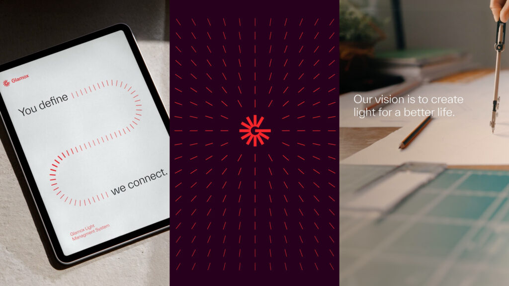
Glamox is a Norwegian industrial group that offers professional lighting solutions to the global market. Since being founded in 1947, Glamox has undergone a very exciting evolution in brand identity, which was finally refreshed in 2022. As creatives in the B2B industry, I believe we all strive to build compelling pieces for brands that empower and connect us to something greater, and that’s what I think Glamox has really captured here. Not only do they have a unique color palette and logo mark, but they’ve managed to visually connect their identity to light as a symbol for brilliance and positivity.
A message, I believe, sets them apart from their global competitors and positions them well above the market’s horizon. I have also really enjoyed seeing their brand elements come to life through animation and contemporary typography. The use of lines can be cumbersome at times, but there’s a nice simplicity to this system that doesn’t overpower the mark or messaging. When seen all together, these brand elements maintain their structure and sophistication across all channels through visual restraint. The humanist sans serif used in tandem with the brand lines and mark create a safe, scalable system that feels intentional and easy to maintain. Which I assume comes as a breath of fresh air to an oversaturated market.
Glamox managed to push through the monotony, risking disconnection and isolation from their heritage to build the brighter future, and I’m all here for it!
3. Elevating Impact: The Summit Foundation’s inspiring rebrand journey
by Senior Designer Alex Flores

Studio Blackburn took on a brand refresh of The Summit Foundation and the result is a forward-thinking identity with a clear goal. This case study is a clear look into how to build a design system that allows the brand to have a wider reach while maintaining its visual integrity.
The Summit Foundation is a people-centered company partnering with non-profits who strive to address critical social and ecological issues in their local community and beyond. From the typeface of the logo to the layout grids used in different pieces of collateral, the goal was to achieve high legibility and emphasize the important topics. The use of greens and blues in the brand color palette also gives a nod to the foundation’s vision statement: a world where nature can thrive and people can flourish. The refreshed brand even translates well in the digital space as they show how its deployed with web and video.
Overall, the identity tells the story of a brand that is community-driven but has a global impact. The Summit Foundation’s design system embraces the negative space and communicates its purpose effectively through color and type. They have a brand identity that allows them to stand out in the B2B space.
4. Unscrambling the letters: Mailchimp’s unconventional campaign experiment
by Designer Lexi Palmer
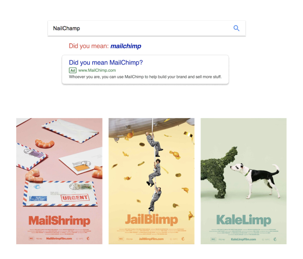
After a podcast’s mispronunciation of their name went viral, MailChimp took the attention and leaned into it. In 2017, New York-based agency Droga5 launched a campaign of nine misspellings of MailChimp, including WhaleSynth, NailChamp, FailChips, and JailBlimp. Each of the nine names had a different activation attached, designed to attract the attention of small business owners. For example, WhaleSynth has a microsite where people could play and mix whale sounds, NailChamp was a social media contest to see who could create the best nail art, and for FailChips, they actually created bags of chips and had pop-ups for people to taste them.
The clever part of this campaign was that MailChimp did not make it obvious that they were behind these activations, so when people who were interested in the campaign googled “KaleLimp,” they would get a Google pop-up saying, “Did you mean MailChimp?” leading them to the MailChimp site explaining the joke.
I like this campaign because all the activations were super fun and creative, it targeted a huge group of people, and relied on people’s curiosity to bring them to the site. They got 988 million earned media impressions, 67 million organic searches, and won several awards for it. While not the most traditional B2B marketing campaign, it was a fun and effective way to get their name out there.
Thanks to Spire’s designers for trading in Creative Suite for Microsoft Word to write this blog post. While these are great pieces of work out in the B2B world, we’re fortunate to have such a talented team here on Keller Springs who produce some of the best design in North Texas, and some of the best B2B work in the country.
To stay up to date on Spire news, awards, and blog posts, subscribe to our Spire Wire newsletter.